A lot goes into a well-designed logo.
This is my typical process for logo creation.
This is my typical process for logo creation.
Step 1: Understanding the need
First I like to gather information about what the organization the logo is representing: who is the target audience for the organization? What is the vibe you want? Are there any special visuals that should be included? Is there a certain style you want?
Step 2: Concept Sketches
I prefer to have at least one week to explore different ideas. I will then send about three concepts to the customer. These concepts are usually rough, hand-drawn sketches that capture an idea, and will be black and white. The customer will choose their favorite; I will provide my own feedback on the concepts if the customer is interested.
Step 3: Digital Mockups
I will experiment with different variations of the chosen logo concept, trying different styles, editing specific elements, and will add text if that was not a major element of the logo mark design. I will send options to the customer to get feedback on the preferred direction. There may be a few rounds of edits to pinpoint the best direction for the logo. This stage will also incorporate a color palette. If the customer has an idea for a palette, we can start with that, otherwise I will provide some palette options.
Step 4: Final Files
Once a final design is decided upon, including text and color palette, then I will create final files for the logo. These files include whatever file type the customer specifies, as well as a native .ai file and multiple transparent PNGs that have different logo layouts (vertical, horizontal, logo mark only, logo and text, etc).
Real-World Example
This is the process for the creation of the logo for Redeemer Presbyterian Church in Santa Rosa, California.
The original brief included the desire to incorporate a table, inspired by the idea that we commune around tables and they are at the central aspect of fellowship. Table imagery is also associated with the Lord's Supper, a key component of regular christian practice. Christians also look forward to celebrate a "feast" in heaven.
The church was also open to other logo concepts, so I explored additional iconography.

The first logo concept was a stylized table set with plates in two different designs. The first design overlapped the stylized plates to create a somewhat-feminine cross, with almost petal like extensions. The second design turned the table into a diamond orientation and the stylized plates were integrated as negative space to create a cross.
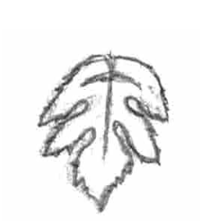
The second concept had a cross incorporated into the middle vein of a grapevine leaf because of the prominence of wine cultivation in Sonoma County.

The third focuses on the landscape of Sonoma County, with the rolling hills and a central sunrise with rays radiating outward.
They chose the first concept, and I provided digital mockups with varying levels of detail and ornamentation.

I did another round of mockups after incorporating feedback, including input from another designer who was a church member.
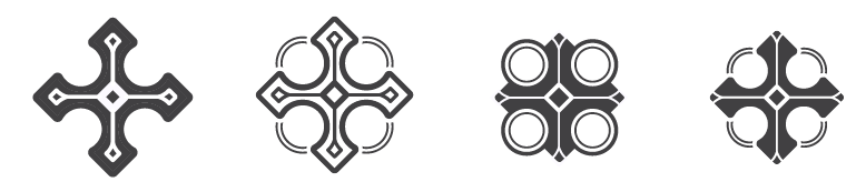
They chose the second design from the above options.
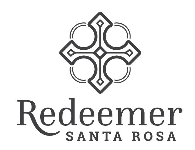
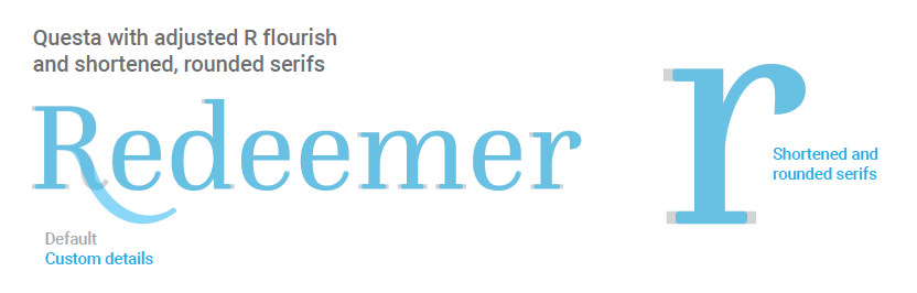
I then created the logo text, which includes some customization, and provided color palette options. The final color palette consists of sage greens and mustard yellows which correlate to the main colors displayed by the Sonoma County hills.
sr

sr
Read more about Redeemer's logo here.